In the world of AI assisted engineering, there’s often a high emphasis on productivity and rapid delivery. A question that I hear frequently is around ROI – how can we quantify the spend on agentic approaches and the outcomes they enable? How do we actually know if we’re seeing the promised impact?
At its core, engineering management is about balance. If you move too fast, quality drops. If you focus solely on quality, delivery stalls. To navigate this, we’ve collected a set of data points that we call our Engineering Vitals — metrics that move us away from “gut feelings” and towards data‑informed conversations.
Metrics can be problematic. Goodhart’s Law states, “When a measure becomes a target, it ceases to be a good measure,” and within engineering this can manifest as promoting bad practices. If people think they’re actively being measured and assessed based on certain data points, they’ll optimise for those. We want to avoid this and instead show people that the data we collect helps them have informed conversations – it exists to empower them, while also allowing people to zoom out and ask, “How is engineering doing? Are we improving? Is the money we’re spending on tools and processes having the desired impact on the parts of our value stream we care about?”
In a larger organisation, you’ll always have complexity: many moving parts, multiple systems, and a lot of change happening in parallel. Sometimes being able to find issues that can be improved requires data to shine a light and point directly at a repository, team, or process that’s having a problem.
Stating “we have technical debt that is slowing us down” doesn’t always tell the story that will get buy‑in. Saying “our build pipelines have slowed down by 30 minutes over the last three months; we execute 100 builds a day, so improving this time will improve our throughput by X%” is much more tangible and outcome‑driven.
A key point is that the Engineering Vitals aren’t measuring people’s performance; we’re measuring our developer experience and trying to find friction points, prove them with data, propose improvements, and then measure the results. If you don’t have data in the first place, how can you know if you’re improving? Having this data is an important enabler, especially if this is something your organisation doesn’t currently have.
What to measure
A Theory of Change maps the journey from initial requirements to real‑world value. While standard engineering metrics often focus on the “factory” (Inputs to Outputs), true success is defined by the “results” (Outcomes and Impact).
The SDLC Value Chain
| Stage | Engineering Context | Measurement Focus |
|---|---|---|
| Inputs | Requirements, user stories, constraints | Scope & readiness |
| Activities | Refinement, acceptance criteria creation, coding | Process efficiency |
| Outputs | Shippable, deployed software | Throughput & velocity |
| Outcomes | Observable changes in customer behaviour | User validation |
| Impact | Measurable shift in core business KPIs | Business value |
Inputs to Outputs: are still useful for understanding engineering health, process bottlenecks, and team velocity.
Outcomes & Impact: is where the real value is understood. These are often trickier to measure consistently as they’re lagging indicators, but they tell us if we built the right thing.
Within our development lifecycle, we can define Impact as the ability to consistently reduce time-to-market while maintaining a high standard of quality. We use activity metrics to make sure that our developer experience isn’t suffering from friction that could be removed even before we consider any agentic approaches.
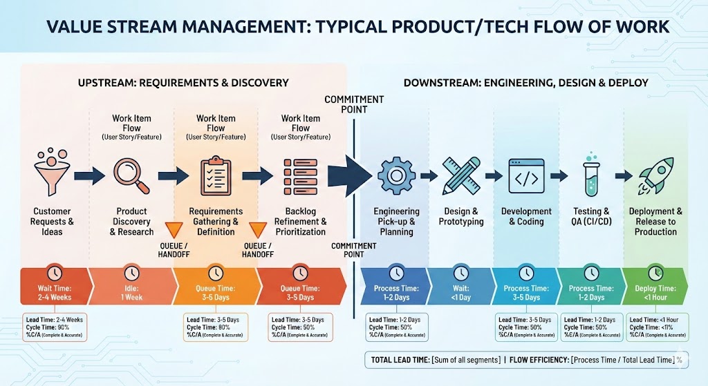
Value stream management
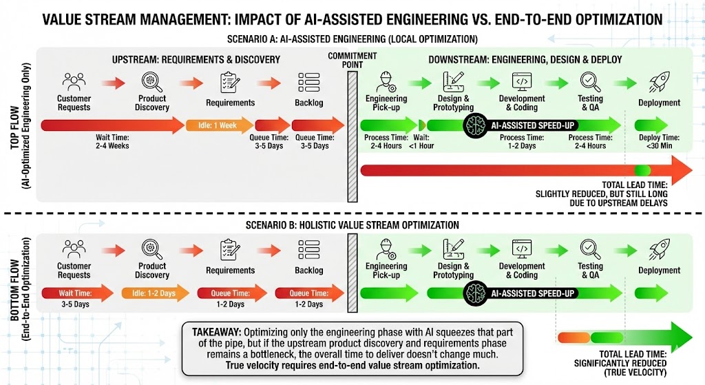
I strongly believe that if you hyper‑focus on the engineering section, without making sure your entire flow of work is efficient, you’ll see only marginal gains from improving the engineering pipe alone. If your engineering practices are already mature and you have solid CI/CD and automation in place, this is especially true.
Baselines over Benchmarks
Before diving into the numbers, it’s important to be clear about how we use these metrics: they’re not intended to directly compare teams or to be used as a stick to bash people with.
Every tech org has different cadences, legacy constraints, and strategies. Comparing a mobile team’s build speed to a backend API team’s is apples-to-oranges. Instead, our goal is to:
- Establish a baseline for specific teams and processes.
- Identify when things are trending negatively.
- When making improvements, use data to validate if a change actually improved the day-to-day lives of our engineers.
We might compare similar capabilities – for example, if a team building an API has a much higher build success percentage and faster build times than another, similar API team, then we can ask whether there are learnings and approaches we can share more broadly. The key is to align and compare on similar capabilities to help drive continuous improvement.
The Pillars of Engineering Health
We group our metrics into four distinct areas to get a view of our developer experience (DevEx).
1. People & Work (The Context)
Metrics like Headcount vs. Job Family don’t tell us if we’re “good”, but they provide the necessary context for everything else. It’s useful to be able to state how many engineers you have in any one business organisation.
Likewise, the amount of work flowing into different parts of your business is important to understand. You may have a particularly busy business organisation versus one that’s more seasonal, and understanding how work flows and the quantity going into teams is important context.
2. Flow & Throughput (Azure DevOps & GitHub)
These metrics tell us how work moves from an idea to a Pull Request.
- Lead Time: The time from work item “Create” to “Close.” Shorter lead times mean faster value delivery.
- PR Cycle Time: PRs should be “ready to ship.” If cycle times stretch from days into weeks, we have a bottleneck in our review process.
- Work Items Completed: We look for steady throughput. Sudden drops usually signal “blocked” work or “invisible” dependencies.
- Deployment Frequency: we look for regular, sustained deployments – we should be shipping constantly to realise the value.
We’ve found that work item tickets that rely on humans opening and closing them at exactly the right times aren’t the best indicators. We can help here with percentiles to drop the anomalies and focus on the 50th and 75th percentile times.
3. Quality & Stability (Bugs & Incidents)
Speed is useless if the product is broken. Speed has been one of the main talking points around AI adoption, but to use a car analogy, the speedometer is only one signal. Your GPS is telling you what direction you’re going in, and your fuel gauge tells you how much further you can go. You need to be listening to all the signals, not just speed, to understand that you’re progressing in the right way.
- Bugs Created vs. Resolved: Healthy teams resolve bugs at roughly the same rate they create them.
- Bug Aging by Priority: Critical bugs should trend down fast. If low-priority bugs are skyrocketing, it’s time for a backlog health check.
- Production Incidents: We aim for a lower, consistent number. High incident noise leads to “alert fatigue,” which is the silent killer of developer productivity.
4. The Build Engine (CI/CD Performance)
This is the heartbeat of the developer experience. If your build is slow, if it’s painful every time you need to make a change, your engineers are frustrated.
- Build Success Rate (Main vs. Non-Main): Your main branch is your path to production; success should be near 100%. We expect non-main branches to have more failures (that’s where experimentation happens), but the gap shouldn’t be massive.
- Build Execution Times:
- Under 5 minutes: excellent flow.
- 15 minutes and up: you start to really feel the pain.
Having a build that succeeds a very high percentage of the time and completes quickly, without much flakiness, is fundamental. Don’t let it drift.
Turning Metrics into Action: OKRs
Data is just noise unless it’s tied to a goal. We use these Vitals to set meaningful OKRs. For example, if a team notices their build times creeping up, their quarter might look like this:
- Objective: Improve build and deployment speed to amplify team effectiveness.
- KR1: Reduce average CI build time from 15 mins → under 8 mins.
- KR2: Reduce average deployment time from 30 mins → under 10 mins.
The raw data points let engineers talk in OKRs and set meaningful targets, and they allow teams to show that if there’s investment in DevEx then there are real, valuable business outcomes that will improve.
Our Approach
ICs should adopt Copilot
We went with the approach that every individual contributor in the Engineer job family – anyone directly contributing to a codebase – should be considered for a Copilot license and encouraged to adapt their workflow to use the tooling.
- Target: 85% adoption with strong Daily Active Usage (DAU).
- Why it matters: High adoption and DAU suggest that the tooling has become embedded and is solving real problems.
Stickiness is important – it’s not only about putting tools in front of people, but actually making sure the tools become part of their daily toolset. They should want to use the tooling because it improves their DevEx.
To determine this is a way that gives us useful insight, we need to capture information from various sources. There are many systems involved in giving a holistic view of your engineering experience, so we built a couple of things to help us grab data and store it centrally.
Ingestion pipeline
We ingest data from Azure DevOps and GitHub by subscribing to a variety of events and creating webhook targets to capture payloads. Everything is written into Log Analytics tables, which gives us a great raw feed of data that we can then perform further analysis on.
Metrics API
We built a simple API for collecting “metrics and measures” data. This exposes a few endpoints that use an opinionated but flexible schema, allowing you to store any structured log data inside Azure Log Analytics. We configured the schema to have a 13‑month retention period to give us year‑on‑year understanding of our data.
We generated a package and added CLI support to work with the API, so you can store and ingest metrics from build pipelines and any other data generators.
Overnight process
We run an overnight process that crunches data from target systems and aggregates it into data points for that particular day. From the raw feed of events from GitHub and Azure DevOps, as well as ServiceNow information, we run queries and capture all the data points, then use the Metrics API for long‑term storage.
For anything where we are calculating time taken, we focus on items that were closed on the day being measured and compute the duration based on their start and end timestamps, which keeps the calculations consistent and easy to reason about.
Grafana Dashboard
Once the data is stored in Log Analytics, it’s simple to surface it in any presentation tooling of choice, such as Power BI or Grafana. We use three levels of views:
Level 1 – top‑level organisation: how we’re progressing as “Engineering” overall.
Level 2 – product group: figures and data limited to that particular group.
Level 3 – repository: all of the data that we aggregate up to L2 and L1 is sourced from repository-level information, and we can always drill down to this level when needed.
This allows us to determine, for example, “our build success rate has dropped in this product group; which repository is causing this?”
By bringing data from multiple sources — Azure DevOps, GitHub, ServiceNow — into a single, holistic view, we’re not just tracking numbers; we’re protecting our most valuable asset: our developers’ time and focus.
OK, what about the ROI?
Measuring these data points is helpful, but it doesn’t fully tell the story that your executives want to hear. Understanding the key questions they’re asking is important.
“We move too slow; we should be shipping faster.”
Because speed is the often‑cited benefit of agentic approaches, it’s important to be able to show where time is actually spent in your value stream.
From “idea” to “shipped to customer” is the important measurement, but it can be hard to quantify unless you have excellent discipline around work item management.
As soon as the idea is first mentioned, log a ticket. As soon as it ships, close it – tie it to a change management process and automate as much of this lifecycle as possible so the data stays trustworthy.
“We are not shipping enough.”
This one is easier, as you can monitor the amount of change made by your organisation. An important optimisation here is to include the number of people you have available in different organisations and overlay that with the amount of changes or releases per month.
An important point: you need to understand the value of the change being delivered. In an ideal flow, teams are delivering frequent small increments that gradually work towards strategic goals, but not all changes are equal in size and complexity. Simply capturing “a change happened” doesn’t tell you how much effort went into it unless you have some lineage back to the work items.
“How many people do I need in this organisation?”
This is a harder question to lean into, but it’s an important one to understand through the lens of an executive team. They’ll be tasked with opex and capex targets, and one of the promises of AI assisted engineering is that you’ll be able to achieve more with less, or at least maintain current delivery with much stronger safety rails and quality.
This is an emotive topic; we see large layoffs across organisations and difficult job markets. Being able to show your numbers, and being clear about changes that are happening and their impact on your ability to deliver, helps here.
For example, if AI reduces average cycle time by 15%, you might:
- ship roughly 15% more work
- reduce required headcount
- or reallocate engineers to higher‑value work.
It depends on where your organisation wants to go, but having the data available helps take some of the emotion out of these conversations and gives everyone a more objective place to stand.
So what?
At some point, the conversation always lands on the same question: “Is this actually worth it?” ROI isn’t “devs feel faster” or “people seem happier on an NPS survey”. Those are useful signals, but if you can’t tie them back to money, they’re just vibes in a spreadsheet.
We have all the other engineering level metrics we’ve just had a look through, but in finance terms, ROI is very simple:
(Financial Benefit – Total Cost) / Total Cost
For engineering, we can unpack that into something a little more tangible:
ROI =
((Engineering Cost × Productivity Gain %)
 + Incident Cost Reduction
 + Revenue Acceleration)
 - AI Tooling Cost
---------------------------------------
AI Tooling Cost
If that number is greater than 1, you’re in a very good place. To keep things grounded, let’s imagine a 3% productivity gain – ultra‑conservative, cynical‑CFO mode – and walk through what that looks like. The numbers are rounded for simplicity, but the shape is what matters.
First, take the size and cost of your engineering organisation:
Engineers: 500
Salary: £50,000
Overhead: 25% (NI, pension, kit, software, management drag, etc.)

£50,000 × 1.25 = £62,500
That gives us a total engineering cost of:
Total Engineering Cost
500 × £62,500 = £31,250,000 per year
Next, layer in the cost of AI‑assisted engineering. The exact number is still emerging and will vary by vendor and usage pattern, but we can pick something sensible:
AI Tooling Cost
£360 per engineer per year: 500 × £360 = £180,000
Add enablement, governance, a bit of overage and whatnot, and we round to roughly £250,000 total annual AI investment.
Now look at the value side. A 3% productivity gain on £31.25M of engineering spend gives:
Productivity Value at 3%
£31.25M × 3% = £937,500
On top of that, assume a modest operational improvement: slightly fewer incidents, slightly shorter lead times, a bit less rework. Call that another £250k of benefit.
Total Benefit
£937,500 + £250,000 = £1,187,500
Put it all together:
(£1.1875M - £0.25M) / £0.25M
= 3.75
= 375% ROI
Even if you’re deeply sceptical of the 3% number, you can flip the equation around and ask, “What’s the minimum productivity lift we need just to break even?”
Break-even Productivity
£250k ÷ £31.25M = 0.8%
You need less than a 1% productivity lift for the investment to pay for itself. That’s the point where the conversation with finance and leadership changes: you can run the same scenarios with your own headcount, costs, and conservative assumptions, and very quickly see whether the story you’re telling about AI‑assisted engineering actually holds up.
Key Takeaway
It’s good to know your data points – being able to answer certain questions quickly and know if you’re trending negatively is important.
However, metrics need to be considered in a holistic way, and you always need to keep value outcomes in view. To really show the speed increases promised by AI, you need to optimise your entire value stream, not micro‑optimise isolated parts or you won’t realise the benefits and you’ll be left asking, “why aren’t we going faster?”
This usually means a business transformation: you need to embed AI practices throughout your discovery phases, requirements gathering, story writing, and beyond. It’s not any one thing in isolation; the acceleration is the sum of the parts. Product Management and Engineering need to work closely together, avoid handoffs, use similar toolsets, and integrate their work as much as possible.
This is the difference between individual productivity and team productivity, and it’s most obvious if you work on a side‑project or hack where you’re the only contributor. The time from idea to implementation is massively accelerated (see this article) because you form the requirements, acceptance criteria, and implementation on the fly, without the normal organisational need to spread that context across a wider team.